TITLE: Voronoi tessellation to measure tree spatial distribution
DATE: 2022-06-12
AUTHOR: John L. Godlee
====================================================================
Voronoi diagrams partition multi-dimensional space into regions,
where all positions within a given region are closest to the same
known point in the multi-dimensional space. Voronoi diagrams are
named after Georgy Voronoy, but can also be called a Dirichlet
tessellation (Peter Gustav Lejeune Dirichlet), or Thiessen polygons
(Alfred H. Thiessen), as the same thing was implemented in
different fields independently.
I discovered voronoi diagrams when researching methods to describe
spatial clustering. I wanted a simple single number measure of how
clustered together trees in a plot are, so that I could include
that metric as a term in a linear model which looked at factors
determining woodland canopy complexity.
What is spatial clustering?
It's useful to think about the distribution of points (spatial
point patterns) by looking at three special cases. The first
special case is complete spatial randomness (CSR), where all points
are located completely independently of one another. The second is
total regularity, where all points are an equal distance from all
nearest neighbours, as in a regular lattice. The third case is
clustering, where points are attracted to each other, rather than
repelled. In ecology speak, you could say that spatial regularity
is the result of negative density dependence, while spatial
clustering is the result of positive density dependence. Regularity
and clustering represent opposite ends of a continuum, with CSR in
the middle, representing the neutral, zero effect. The continuum is
bounded at the end of regularity; given a number of individuals in
a space they can only get so far away from their neighbours. At the
clustered end of the continuum, I imagine the theoretical limit to
clustering would be when all points occupy the same single point in
the plot space. The idea of randomness is difficult to comprehend
from just one sample. A random distribution could by chance be
identical either an even distribution or a clustered distribution.
Experiments on randomly generated data will have to be repeated
many times to understand the average effect.

This thought experiment assumes that we are sampling the whole
population and the whole available space, but in reality, as the
negative density dependence effect increases, the population
sampled in the sampling frame merely gets smaller, and the
remaining individuals get pushed to outside the sampling frame.
Similarly, although there is no theoretical limit on the clustering
effect, in biology there is a practical one. It is unlikely that
the benefits of clustering among individuals, trees for example,
would not be offset by other factors at very close spatial scales,
such as the occupation of the same physical space by their trunks.
Extracting metrics from voronoi diagrams
On their own, voronoi diagrams don't provide any metrics of spatial
distribution, they are merely a visual and mathematical
representation of a point distribution. From the voronoi polygons
however, one can extract various metric related to the size, shape
and distribution of the polygons themselves. This is the focus of
my investigation in this blog post.
The point distribution norm (Gunzburger and Burkardt 2004) is
calculated as:
[Gunzburger and Burkardt 2004]:
https://people.sc.fsu.edu/~jburkardt/publications/gb_2004.pdf
$$
h = \textnormal{max} h_{i} \\\
h_{i} = \textnormal{max} |z_{i}-y|
$$
where y is the point, and z_(i) are the voronoi cell vertices.
h_(i) is the distance from the point to the furthest vertex.
Smaller h implies a more uniform distribution.
The point distribution ratio is calculated as:
$$
\mu = \frac{\textnormal{max} h_{i}}{\textnormal{min} h_{i}}
$$
where h_(i) is same as above. For a uniform distribution μ = 1.
The regularity measure (Gunzburger and Burkardt 2004) is calculated
as:
$$
\chi = \textnormal{max} \chi_{i} \\\
\chi_{i} = \frac{2h_{i}}{\gamma_{i}}
$$
where γ_(i) is the minimum distance between a point i and its
nearest neighbour, and where h_(i) is the same as the point
distribution norm. For a uniform distribution χ = χ_(i),
smaller is more uniform.
The cell area deviation (Gunzburger and Burkardt 2004) is
calculated as:
$$
\upsilon = \frac{\textnormal{max} V_{i}}{\textnormal{min} V_{i}}
$$
where V_(i) is the area of cell i. In a uniform distribution,
υ = 1.
The Polsby-Popper index (Polsby and Popper 1991) describes the
compactness of a shape. It was originally developed to quantify the
degree of gerrymandering of political districts in the USA. For a
given voronoi cell, it is calculated as:
[Polsby and Popper 1991]:
http://hdl.handle.net/20.500.13051/17448
$$
PP(D) = \frac{4\pi A(D)}{P(D)^{2}}
$$
where D is the voronoi cell, P(D) is the perimeter, and A(D) is the
area. Lower values of PP(D) imply less compactness.
Cell elongation is calculated by fitting the minimum bounding
rectangle to the voronoi cell, then taking the ratio of the length
of the longer side to the shorter side.
The distance between the centre of gravity (centroid) of the
voronoi cell and the point is influenced by the regularity of
distribution of neighbouring points. As the distribution deviates
from evenness, the distance of points from their cell centroid
increases.
Non-voronoi measures of spatial pattern
There are many other measures of spatial point patterns and
clustering which aren't related to voronoi tessellation. I'll
describe some of these methods below, and use them as a comparison
to the metrics I derive from the voronoi polygons.
Ripley's K and Ripley's L
Ripley's K function measures the expected number of neighbours
found within a given distance of a randomly selected point. To use
Ripley's K to test for CSR, one can simulate a number of random
point distributions within the same area as the real population,
say 100 or 1000 (multiples of 10 make it easier to estimate
P-values), then see whether the real Ripley's K overlaps with the
simulated Ripley's K functions.
Ripley's K is often re-calculated as Ripley's L, also known as the
variance stabilised Ripley's K function. Ripley's L is
approximately constant under CSR. If L_(obs) < L_(exp), the
pattern is more regular than expected, while if
L_(obs) > L_(exp), the pattern is more clustered than expected.
Further Ripley's L is sometimes plotted as L_(r) r, so that the
zero line and envelope bounding CSR are horizontal.
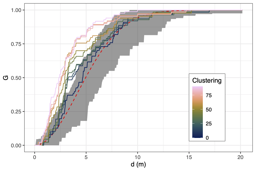
Here's an example of calculating and visualising Ripley's K,
Ripley's L, and L-r using a real world vegetation survey plot in
miombo woodlands in southwest Angola.
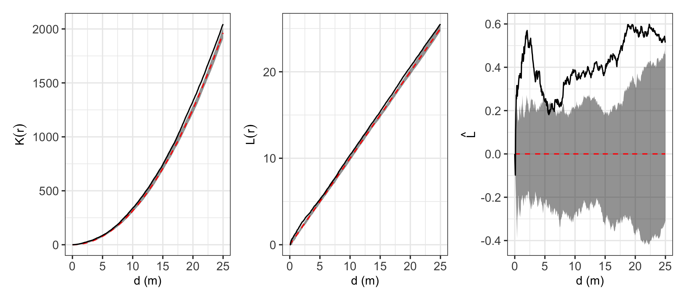
In this example, it looks like stems are generally more clustered
than expected at all observed distances. Clustering effects are
especially prominent up to ~2.5 m. This may actually be due to some
trees having multiple stems growing from the same root stock, but
were not observed to connect above the ground, and were thus
recorded as separate individuals.
Winkelmass
I wrote about the Uniform Angle Index, or winkelmass, in a previous
post. The winkelmass (Pommerening 2006) measures the spatial
distribution of trees according to the angles between neighbouring
trees. For this experiment I calculated the plot level mean and the
coefficient of variation of the winkelmass. I won't go into massive
detail about how the winkelmass works, as I've talked about it
before, but here is a diagram which shows how trees are scored
based on the spatial distribution of their four nearest neighbours.
Higher scores imply clustering, while lower scores imply regularity.
[Pommerening 2006]:
https://doi.org/10.1016/j.foreco.2005.12.039

Nearest neighbour distances
Nearest neighbour distance distributions are commonly used to
describe spatial point patterns, and are included in the
calculations for some of the voronoi-derived metrics. I also chose
to calculate the coefficient of variation of nearest neighbour
distances as a simple measurement of the heterogeneity in spatial
relations among individuals across the plot, and the plot level
mean of nearest neighbour distances to measure crowding across the
plot.
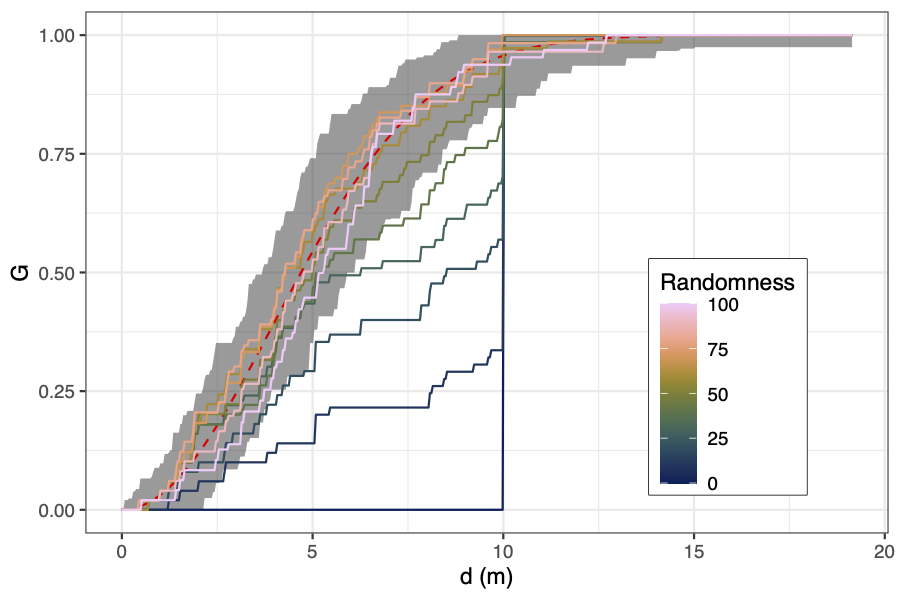
You can get a visual representation of how close a point
distribution is to CSR by comparing the cumulative density
distribution of nearest neighbour distances against the theoretical
cumulative distribution for a completely random spatial point
pattern, which should be
G_(r) = 1 − exp(−λ * π * r²). As with the
Ripley's K and L functions, you can compute simulations to
construct a confidence interval ribbon. Points rising above the
ribbon are more clustered than expected at that spatial scale.
Simulating the behaviour of the metrics
To generate a gradient of evenness to randomness, I started off
with a grid of 100 points with 10 metres between each point. Then I
sequentially moved randomly chosen points to a random location in
the plot. After all points had been moved I assumed the points were
distributed completely at random. I repeated this process with 50
replicates. The R code to generate these data is below.
# Create a regular grid of points
# 5 m buffer inside plot
# 10 m between points
# 100x100 m grid
xy_vec <- seq(5, 100, 10)
dat <- expand.grid(xy_vec, xy_vec)
names(dat) <- c("x", "y")
# Number of replicates
reps <- 50
# Replicate grid of points
even_list <- replicate(reps, dat, simplify = FALSE)
# Possible coordinates for movement
c_repls <- seq(0,100,0.1)
# For each replicate, randomly move points
# Move every point once
# Evenness -> randomness
even_csr_points <- mclapply(even_list, function(x) {
# Randomise order in which points are moved
ord <- sample(seq_len(nrow(x)), nrow(x))
# Create list to fill
x <- list(x)
# For each point
for (i in seq_len(nrow(x[[1]]))) {
x[[i + 1]] <- x[[i]]
# Move point to a random location
x[[i + 1]][ord[i], c("x", "y")] <- sample(c_repls, 2,
replace = TRUE)
}
return(x)
}, mc.cores = 4)
{{< video src="/vid/voronoi/even_csr.webm" >}}
To generate a gradient of randomness to clustering, I started off
with 100 points randomly distributed in the plot. Then I randomly
assigned 10 points to act as "cluster points". For each of the
remaining 90 points I then randomly chose points and moved them
closer to their nearest cluster point by half their original
distance. The R code to generate these data is below.
rand_list <- replicate(reps,
data.frame(
x = sample(c_repls, 100),
y = sample(c_repls, 100)),
simplify = FALSE)
# For each replicate, randomly points closer to nearest cluster
point
csr_clust_points <- mclapply(rand_list, function(x) {
# Define points to use as clusters
clust_rows <- sample(seq_len(nrow(x)), 10)
# Extract cluster points
clust_pts <- x[clust_rows,]
# Extract non-cluster points
pts <- x[-clust_rows,]
# Find nearest cluster point for each non-cluster point
nn <- nn2(clust_pts[,1:2], pts[,1:2], k = 1)[[1]]
# Randomise order in which points are moved
ord <- sample(seq_len(nrow(pts)), nrow(pts))
# Create list to fill
pts <- list(pts)
# For each point
for (i in seq_len(nrow(pts[[1]]))) {
pts[[i + 1]] <- pts[[i]]
# Get midpoint between chosen point and cluster point and
update coords
pts[[i + 1]][i,1:2] <- (pts[[i + 1]][i,1:2] +
clust_pts[nn[i],1:2]) / 2
}
return(pts)
}, mc.cores = 4)
nn2() comes from the {RANN} package, which provides a really fast
nearest neighbour function. mclapply() comes from the {parallel}
package.
[package]:
https://cran.r-project.org/web/packages/RANN/index.html
{{< video src="/vid/voronoi/csr_clust.webm" >}}
For the evenness to randomness dataset, I ended up with 50
replicates, each containing, 101 plots, with each plot containing
100 points. A total of 505000 points for which I had to calculate
voronoi polygons. Similarly, the randomness to clustering dataset
contained 509190=409500 points. Originally, I was using the
st_voronoi() function from the {sf} package to calculate the
voronoi polygons, but this was far too slow for my purposes, and
the resulting data files were huge, hundreds of MB even when
compressed into a .rds file. In the end I settled on using the
{deldir} package, which provides a really fast voronoi tessellation
function that returns only the coordinates of the vertices of each
polygon. This took the size of the data files down to about 2 MB.
The R code I used to process the points is below.
vor_polys <- lapply(list(even_csr_points,csr_clust_points),
function(i) {
mclapply(seq_along(i), function(x) {
lapply(seq_along(i[[x]]), function(y) {
message(x, ":", y)
vor <- deldir(i[[x]][[y]], rw = c(0,100,0,100))
vor_tiles <- tile.list(vor)
lapply(vor_tiles, function(z) {
cbind(z$x, z$y)
})
})
}, mc.cores = 4)
})
Predictions
In summary, I derived the following metrics of point dispersion:
- Mean winkelmass
- Coefficient of variation of winkelmass
- Coefficient of variation of nearest neighbour distance
- Point distribution norm
- Point distribution ratio
- Regularity measure
- Mean distance between centre of gravity of cell and point
- Coefficient of variation of distance between centre of gravity
of cell and point
- Cell area deviation
- Coefficient of variation of cell area
- Coefficient of variation of the Polsby-Popper index
- Coefficient of variation of cell elongation
I thought it would be good practice to make predictions of how each
measure might vary along a continuum from evenness to randomness to
clustering:
- Mean winkelmass
- Even-random: increase
- Clustered-random: no change
- Coefficient of variation of winkelmass
- Even-random: increase
- Random-clustered: no change
- Coefficient of variation of nearest neighbour distance
- Even-random: increase
- Random-clustered: decrease
- Point distribution norm
- Even-random: increase
- Random-clustered: increase
- Point distribution ratio
- Even-random: increase
- Random-clustered: increase
- Regularity measure
- Even-random: decrease
- Random-clustered: no change
- Mean distance between centre of gravity of cell and point
- Even-random: no change
- Random-clustered: no change
- Coefficient of variation of distance between centre of gravity
of cell and point
- Even-random: increase
- Random-clustered: increase
- Cell area deviation
- Even-random: increase
- Random-clustered: increase
- Coefficient of variation of cell area
- Even-random: increase
- Random-clustered: increase
- Coefficient of variation of the Polsby-Popper index
- Even-random: increase
- Random-clustered: increase
- Coefficient of variation of cell elongation
- Even-random: increase
- Random-clustered: increase
Results of simulations
Here are the results for the even-random experiment:
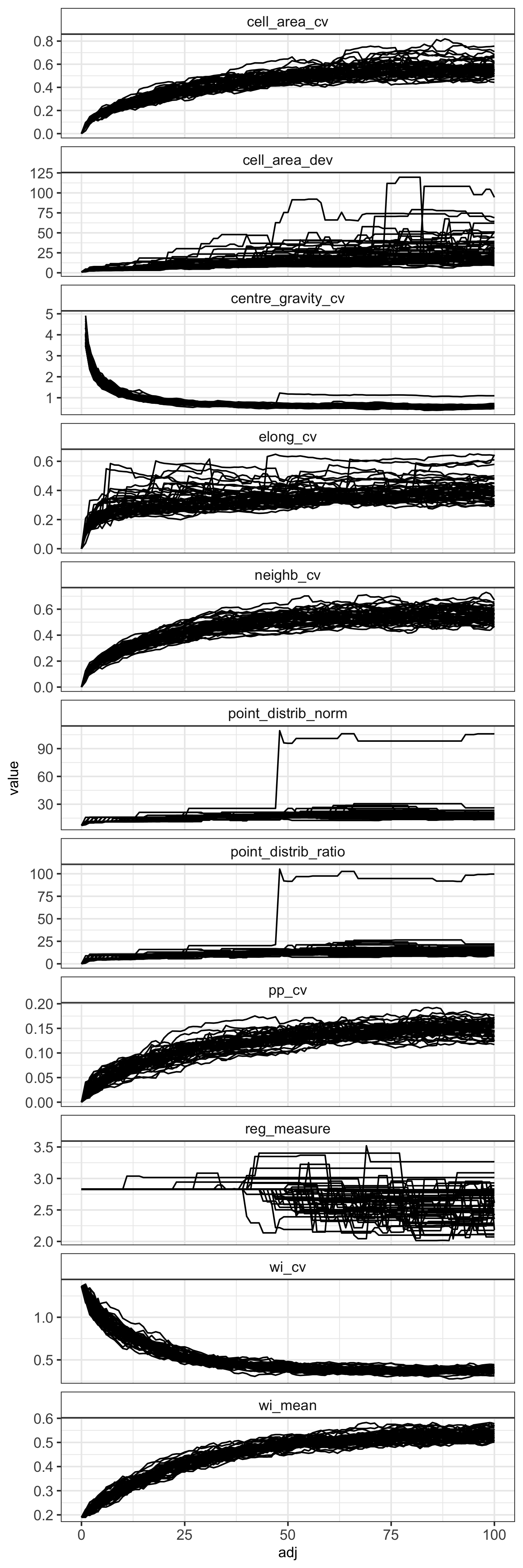
The coefficient of variation of the winkelmass acts in the opposite
way to what I expected, decreasing with randomness. I can't really
understanding why this is the case, but it's a clear trend. I'd
expect that as randomness increases, there is greater variation in
the spatial distribution of nearest neighbours.
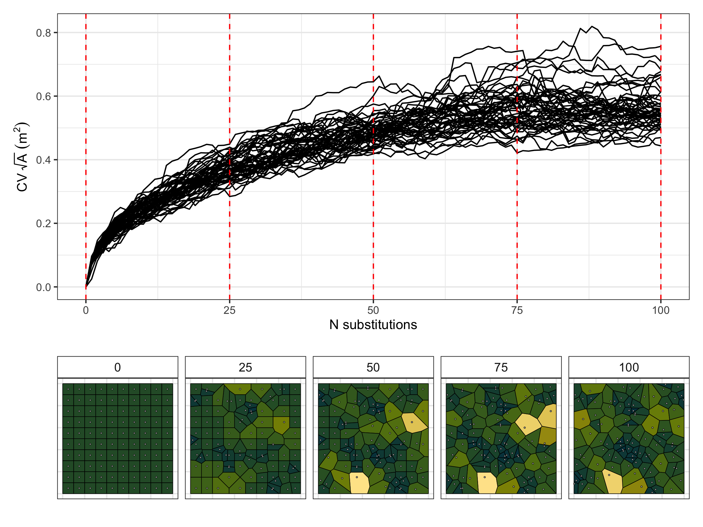
There are also some measures that simply didn't work. The point
distribution norm and point distribution ratio for instance, just
didn't behave how they were suggested in the literature I read. In
the plot above you can see that in one simulation the point
distribution norm and point distribution ratio suddenly jump up at
around 50 substitutions. I looked into what was going on with the
that made this happen. It seems that these metrics break down if
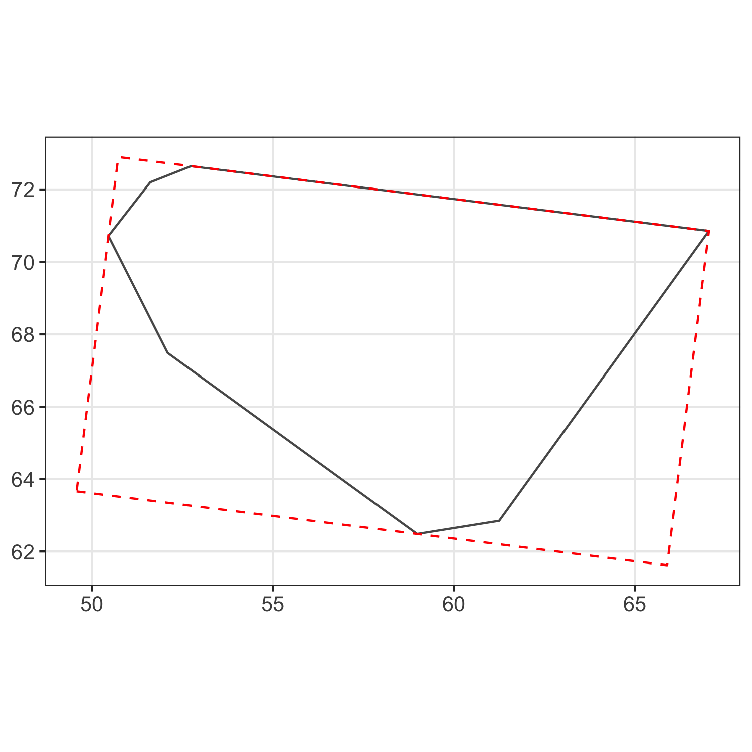
two points are in exactly the same location. See the plot below,
which shows the points and their voronoi cells overlaid at two
consecutive intervals. The point which moves between these two
intervals is highlighted as a blue square, while the points which
don't move are grey circles. The original position of the points
are presented as small markers, and the positions after the
movement are presented as large markers. The voronoi cells before
the movement are thick black lines, and after the movement are thin
orange lines. I guess when a point is moved to exactly the same
position as another point their voronoi cells are extremely small
and this somehow messes up the metric? I still haven't got to the
bottom of this one.
The regularity measure, although it does show a general decrease in
regularity as randomness increases, there is lots of noise, and
definitely isn't monotonic, which I think limits its usefulness.
Same with the cell area deviation, it does show a general increase
with randomness, but it isn't consistent.
The coefficient of variation of cell elongation increases with
randomness, but it's quite noisy among simulations, and the measure
saturates quickly.
There's a weird effect where in one simulation the coefficient of
variation of the cell centre of gravity suddenly increases before
continuing to decrease as in the other simulations. Like with the
point distribution norm, this appears to happen when in one
simulation a point is moved to the exact same position as another
point.
None of the measures increased linearly, but maybe this has more to
do with how I generated the transition from evenness to randomness.
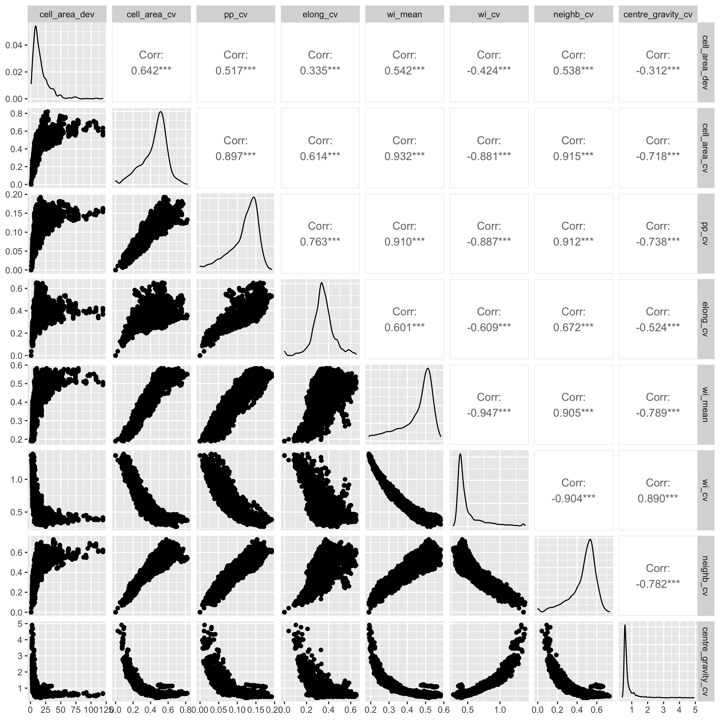
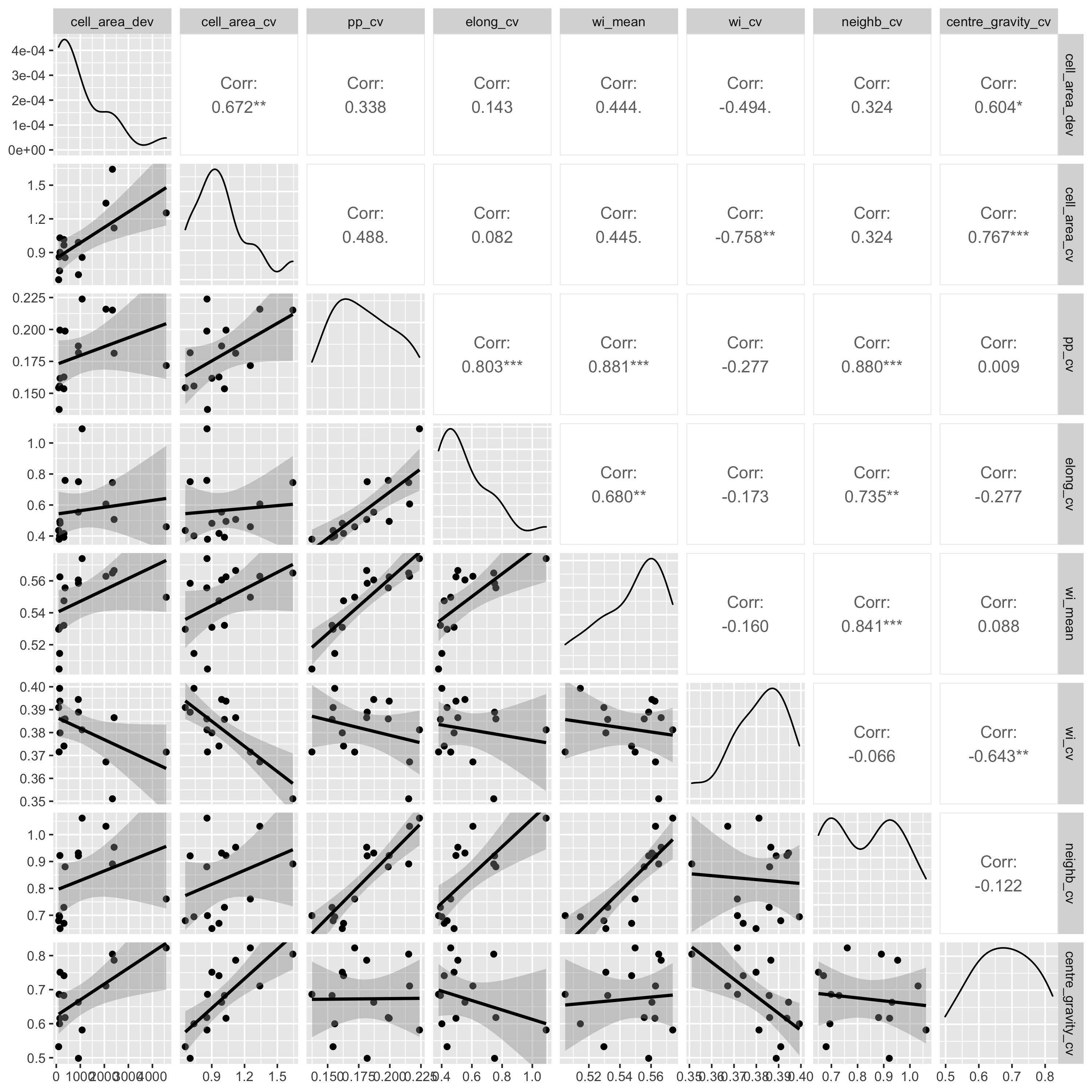
I also did pairwise comparisons of the metrics, to see how they
relate to each other. All the metrics were significantly correlated
with each other according to a Pearson's correlation coefficient,
but some of the relationships are definitely not linear, so take
those correlations with a pinch of salt. I also did a spearmans
rank test and there were also all significantly correlated. Some
interesting relationsips I see are that as the mean winkelmass
increases, the coefficient of variation of the winkelmass
decreases. I think this is because as points become less evenly
distribution, thus increasing the mean winkelmass, it also means
that neighbours are likely to be less evenly distributed, i.e. the
points are not totally independent of each other. Also, as cell
area coefficient of variation increases, the coefficient of
variation of nearest neighbour distances also increases and the
coefficient of variation of the polsby-popper index increases. This
means basically that cells get longer as they become less evenly
distributed, makes sense.

The results for the random-clustered data are not so pretty. Some
metrics, like the coefficient of cell area and mean winkelmass do
appear to increase with clustering, but understandably, all metrics
are heavily dependent on the starting distribution of the points,
which were generated randomly. I guess maybe if I had many more
simulations I might start to see more clear patterns. It's curious
that some of the measures like the point distribution norm, point
distribution ratio, and regularity measure stay the same for many
point movements, then suddenly increase or decrease, while other
metrics are a lot more sensitive to each movement. This is because
some of the metrics, particularly those presented in Gunzburger and
Burkardt (2004), rely on changes in the maximum value of some
metric measured across all points, so there's often no observed
change in the metrics even though there's lots of change happening
with values less than the maximum.
A real world test
I have some real data from my field site in southwest Angola,
Bicuar National Park, where we have 15 permanent vegetation
monitoring plots. Each plot is 100x100 m (1 ha). In each plot I
have the location of each tree with at least 1 stem >5 cm stem
diameter at 1.3 m height (DBH, diameter at breast height). Tree
locations were recorded using an XY grid coordinate system, using
tape measures.