TITLE: Display lots of points with tiles in ggplot2
DATE: 2021-09-25
AUTHOR: John L. Godlee
====================================================================
I was making a map for my PhD thesis which showed the locations of
field studies of the Biodiversity-Ecosystem Function Relationship,
taken from three meta-analyses (Duffy et al. 2017, Clarke et al.
2014, and Liang et al. 2016). I wanted to demonstrate how few
studies have been conducted in southern Africa, with the purpose of
showing the reader that this is a problem that I was going to solve
in the thesis.
[Biodiversity-Ecosystem Function Relationship]:
https://doi.org/10.1146/annurev-ecolsys-120213-091917
[Duffy et al. 2017]:
https://doi.org/10.1038/nature23886
[Clarke et al. 2014]:
https://doi.org/10.1016/j.tree.2017.02.012
[Liang et al. 2016]:
https://doi.org/10.1126/science.aaf8957
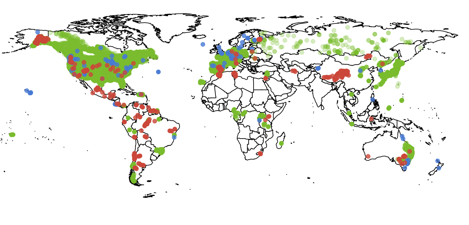
I wanted to include the map in my thesis as vector graphics,
because they compress better than raster images and look crisper on
the computer screen. The problem was that the .pdf output of the
map from ggplot2 in R was 22.5 MB, which on its own is about as
large as the rest of the thesis pdf. The reason the file was so
large is because there were lots of overlapping points.
I spent a long time thinking about technical ways to reduce the
file size, using different exporter libraries like Cairo, or using
an alternative file type, but nothing managed to maintain the
quality of the original image while also reducing the file size.
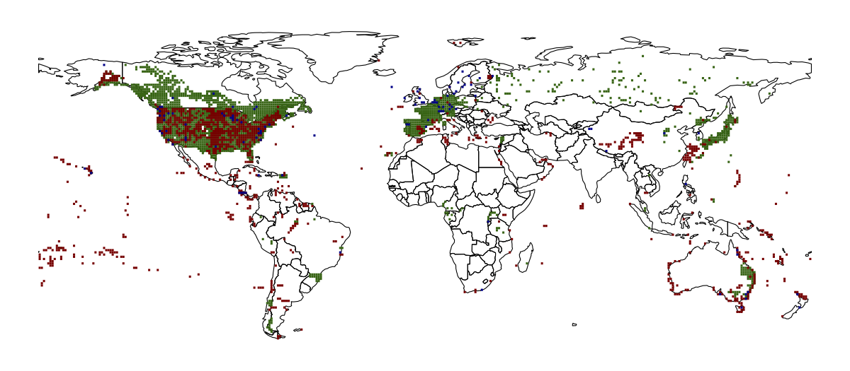
In the end, I decided to redesign the map to use raster tiles
instead of points. A tile was counted as filled if there was at
least one point found within it. Here is the code I used to convert
the points to raster, in R:
library(sf)
library(dplyr)
library(ggplot2)
library(rnaturalearth)
library(raster)
world <- ne_countries(returnclass = "sf") %>%
filter(continent != "Antarctica")
coord_all <- readRDS("dat/coord_all.rds")
coord_all is a list of three dataframes, each from a different
meta-analysis, where each dataframe has two columns with the
latitude and longitude of each study. Next I lapply() over each
dataframe. First I convert the dataframe to sf points, then create
an empty raster spanning the whole earth, then use rasterize() to
fill the raster and finally convert the raster to a dataframe for
plotting in ggplot().
coord_all_rast <- lapply(coord_all, function(x) {
x_sf <- st_as_sf(x[,2:3], coords = c("lon", "lat")) %>%
st_set_crs(4326)
x_rast <- raster(crs = crs(x_sf), vals = 0,
resolution = c(1,1), ext = extent(c(-180, 180, -90, 90)))
%>%
rasterize(x_sf, .) %>%
as(., "SpatialPixelsDataFrame") %>%
as.data.frame(.)
return(x_rast)
})
Then it's just a case of using geom_tile() on each dataframe. I
stacked the tile layers according to the number of filled tiles, as
the dark blue layer doesn't have many filled tiles and was getting
masked by the dark green layer.
# Plot
map <- ggplot() +
geom_sf(data = world, colour = "black", fill = NA, size =
0.25) +
geom_tile(data = coord_all_rast[[2]], aes(x = x, y = y),
fill = "darkgreen", alpha = 1) +
geom_tile(data = coord_all_rast[[3]], aes(x = x, y = y),
fill = "darkred", alpha = 1) +
geom_tile(data = coord_all_rast[[1]], aes(x = x, y = y),
fill = "darkblue", alpha = 1) +
theme_void() +
theme(legend.position = "none")
pdf(file = "img/befr_map.pdf", width = 8, height = 3.5)
map
dev.off()