TITLE: Random effects plots
DATE: 2020-10-25
AUTHOR: John L. Godlee
====================================================================
I was forwarded a question about how to customise
sjPlot::plot_model(). The colleague wanted to plot slopes of fixed
effects at different levels of a random effect, in a random slope
linear mixed effects model.
[sjPlot::plot_model()]:
https://cran.r-project.org/web/packages/sjPlot/index.html
Load some packages:
library(ggplot2)
library(lmerTest)
library(sjPlot)
library(tibble)
library(purrr)
The example model was:
model <- lmerTest::lmer(mpg ~ cyl + disp + hp + drat + wt +
qsec + carb +
(1|am) + (cyl + disp + hp + drat + wt + qsec + carb|gear),
data = mtcars, REML = FALSE)
This model doesn't even converge properly, but resembles the
structure of their actual model.
The random effects are plotted like this:
sjPlot::plot_model(model, type="re", vline.color="#A9A9A9",
dot.size=1.5,
show.values=F, value.offset=.2)[[1]]
This produces a pretty ugly plot, which compresses the x axis and
makes it difficult to compare slopes.
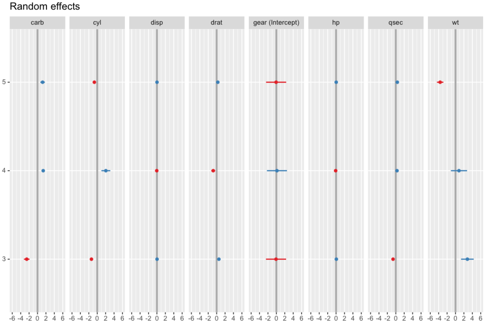
Specifically, they wanted to plot the random effects for gear only,
rearrange the figure to have 3 rows and 3 columns, and order the
facets with intercept at the start.
The code below basically simplifies the source code of
sjPlot:::plot_type_ranef() for our specific situation.
First, extract random effects for gear:
rand_ef <- ranef(model)[[1]]
Then, extract the standard errors:
vars.m <- attr(rand_ef, "postVar")
K <- dim(vars.m)[1]
J <- dim(vars.m)[3]
names.full <- dimnames(rand_ef)
rand_se <- array(NA, c(J, K))
for (j in 1:J) {
rand_se[j, ] <- sqrt(diag(as.matrix(vars.m[, , j])))
}
dimnames(rand_se) <- list(names.full[[1]], names.full[[2]])
Define some parameters for confidence intervals:
ci.lvl <- 0.95
ci <- 1 - ((1 - ci.lvl) / 2)
Make rownames a column for both effects and SEs:
rand_ef <- rownames_to_column(rand_ef)
rand_se <- rownames_to_column(as.data.frame(rand_se))
Define group names:
grp.names <- colnames(rand_ef)
alabels <- rand_ef[["rowname"]]
For each effect, calculate values per level of gear:
mydf <- map_df(2:ncol(rand_ef), function(i) {
out <- data_frame(estimate = rand_ef[[i]])
# Calculate confidence intervals
out$conf.low = rand_ef[[i]] - (stats::qnorm(ci) *
rand_se[[i]])
out$conf.high = rand_ef[[i]] + (stats::qnorm(ci) *
rand_se[[i]])
# set column names (variable / coefficient name)
# as group indicator, and save axis labels and title in
variable
out$facet <- grp.names[i]
out$term <- factor(alabels)
# create default grouping, depending on the effect:
# split positive and negative associations with outcome
# into different groups
out$group <- dplyr::if_else(out$estimate > 0, "pos", "neg")
return(out)
})
Make facet a factor to control plotting order:
mydf$facet <- factor(mydf$facet,
levels = c("(Intercept)", "wt", "cyl", "carb", "disp",
"drat",
"hp", "qsec"))
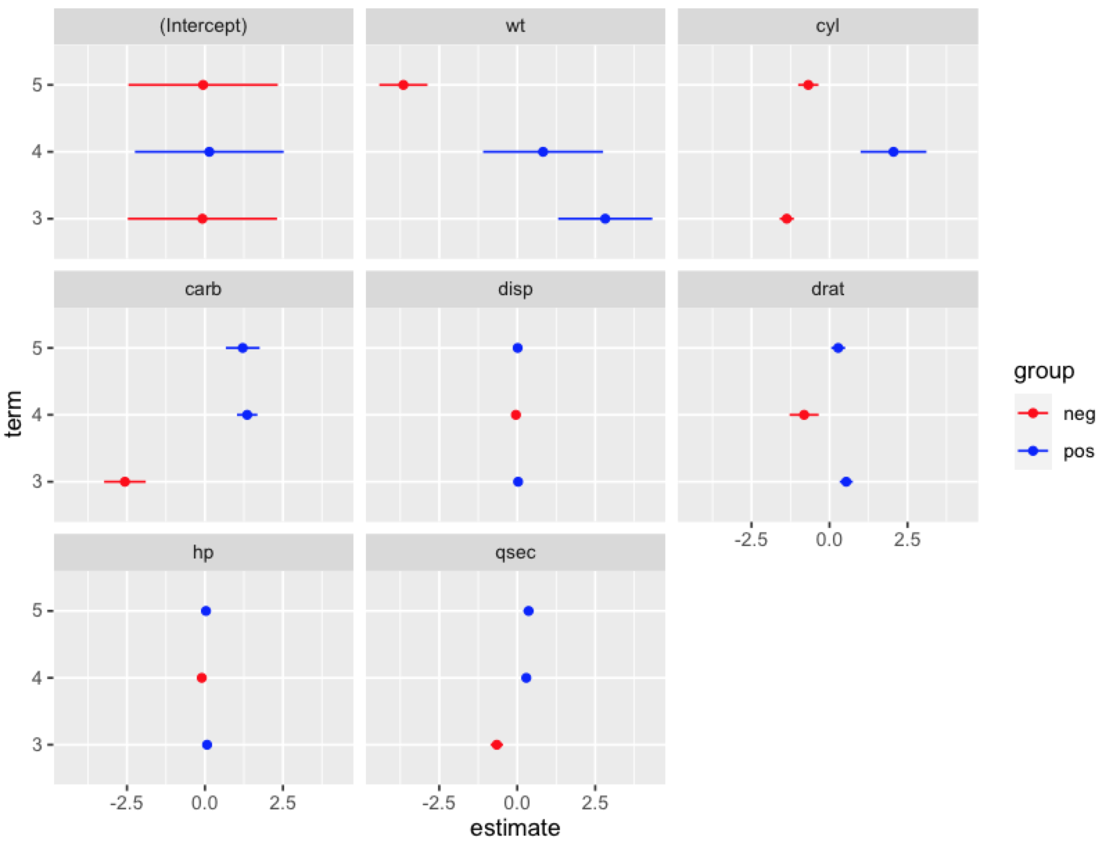
Create plot:
ggplot() +
geom_point(data = mydf,
aes(x = estimate, y = term, colour = group)) +
geom_errorbarh(data = mydf,
aes(xmin = conf.low, xmax = conf.high, y = term, colour =
group),
height = 0) +
scale_colour_manual(values = c("red", "blue")) +
facet_wrap(~facet)