TITLE: Making better ggiNEXT plots
DATE: 2019-11-15
AUTHOR: John L. Godlee
====================================================================
There is an R package called iNEXT which allows you to rarefy and
extrapolate Hill numbers (measures of diversity) to correct for
differences in sampling effort between replicates. In my case, I
have a dataset of plots (replicates) with trees in them, but the
plots vary in size (sampling effort). Smaller plots by probability
will have fewer species in them, but this doesn't mean the
landscape species richness is lower.
[iNEXT]:
https://besjournals.onlinelibrary.wiley.com/doi/10.1111/2041-210X.12
613
I start off with a list where each list item is a vector of species
abundances found in a particular plot. In this example I'm using
the spider dataset which comes from iNEXT. I'll also load some
packages:
library(iNEXT)
library(ggplot2)
library(dplyr)
data(spider)
Then I run iNEXT() on the data to estimate the Hill Number of order
q, which is the equivalent numbers species richness:
inext_out <- iNEXT(spider, q = 0, datatype = "abundance")
The default visualisation provided by iNEXT looks like this:
ggiNEXT(inext_out)
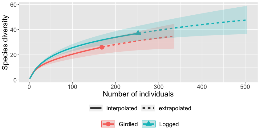
It's pretty ugly and I think it makes some bad design choices. It
works fine for a visualisation during analysis, but if I want to
put this figure in an article it needs to look crisper.
I define a function to create a better ggplot() object from the
output of iNEXT():
ggiNEXT_fix <- function(x){
inext_out_list <- list()
inext_out_list[[1]] <- bind_rows(x$iNextEst, .id = "id")
inext_out_list[[2]] <- inext_out_list[[1]] %>% filter(method ==
"observed")
inext_out_list[[3]] <- inext_out_list[[1]] %>% filter(method ==
"interpolated")
inext_out_list[[4]] <- inext_out_list[[1]] %>% filter(method
== "extrapolated")
inext_out_list[[5]] <- inext_out_list[[1]] %>% group_by(id) %>%
summarise(m_max = max(m), qd_max = max(qD))
ggplot() +
geom_line(data = inext_out_list[[3]],
aes(x = m, y = qD, colour = id, linetype = "Interpolated"))
+
geom_line(data = inext_out_list[[4]],
aes(x = m, y = qD, colour = id, linetype = "Extrapolated"))
+
geom_point(data = inext_out_list[[2]],
aes(x = m, y = qD, fill = id, shape = "Observed"),
size = 2, colour = "black") +
geom_point(data = inext_out_list[[5]],
aes(x = m_max, y = qd_max, fill = id, shape =
"Extrapolated"),
size = 2, colour = "black") +
scale_linetype_manual(name = NA,
values = c(3, 1), labels =
c('Extrapolated','Interpolated')) +
scale_shape_manual(name = NA,
values = c(22,21), labels = c("Extrapolated",
"Interpolated")) +
scale_fill_discrete(name = NA, guide = FALSE) +
labs(x = "Bootstrap sample size", y = "Extrapolated species
richness") +
theme_classic() +
theme(legend.title = element_blank())
}
ggiNEXT_fix(inext_out)
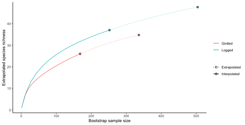
Of course, the default ggiNEXT() function is a lot more flexible
than my function, it can create different plots depending on
options given, like facetting by Hill number if there are multiple
or facetting by both Hill number and sample if there are lots of
samples. It can also make sample completeness curves and
coverage-based rarefaction/extrapolation curves, which my function
can't do. Maybe in the future if I need to plot those methods I
will expand the function.