TITLE: Hotter than average map
DATE: 2019-06-05
AUTHOR: John L. Godlee
====================================================================
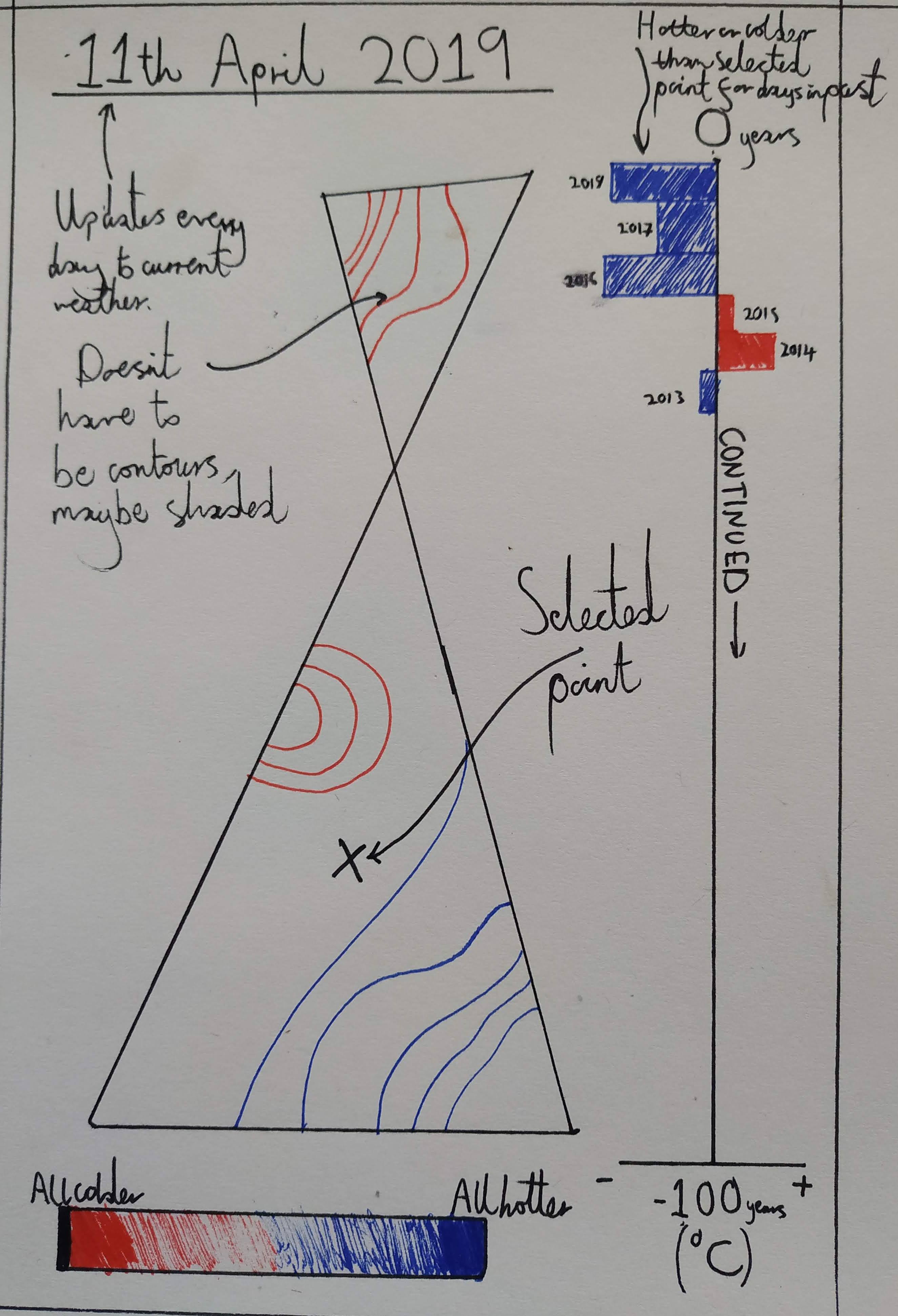
I've had this idea for a web app which shows a map of the UK and a
heatmap layer which shows whether a certain spot was hotter or
colder than the average temperature on the current day of the year
over the last 100 years, and by how much.
Points on the map should be selectable, which activates a split bar
chart on the right hand side of the panel. Each bar should show
whether the selected point was hotter or colder than the equivalent
day of the year in previous years.