TITLE: Visualising Survey Data with Likert Scales
DATE: 2017-09-16
AUTHOR: John L. Godlee
====================================================================
Recently I was offered a small amount of consulting work. A company
had conducted a survey over Survey Monkey to look at how satisfied
and engaged their employees were and my job was to analyse these
data to try and tease out any trends. Finally I had to visualise
the data in a way that the company could put together in a little
report and talk about in a meeting. Obviously I can't show any of
the graphs or data that I analysed for that job, because of
confidentiality laws, so I've created an example dataset that I can
use to demonstrate some of the methods I came up with for
effectively visualising the data.
I used R to analyse the data, purely because that is what I know,
though I know the company does the vast majority of their stuff in
Excel.
If you want to follow along you can download the data from here and
an example script from here
[here](
https://johngodlee.xyz/files/likert/example.csv)
[1](
https://johngodlee.xyz/files/likert/example_likert.R)
Cleaning the data
First I need to install some packages, set the working directory
and load the data into R:
# Packages
library(dplyr)
library(tidyr)
library(ggplot2)
# Set the working directory
setwd("~/survey_data")
# Import data
survey <- read.csv("example.csv")
Then I can have a look at the data and see that Survey Monkey has
given each respondent a row, each column indicates an answer for a
given question, e.g. "I would work for comX again - Disagree",
"What type of employee are you - Admin". This means that in any
given column many of the cells are empty, and it violates one of
the golden rules of making a table of data, that each column should
contain unique data.
I have no idea why survey monkey thinks this is a good way to
format their data output, but luckily it's easy to remedy using
some dplyr and tidyr magic
First I need to check for any NA and replace them with blank space:
survey[is.na(survey)] <- ''
Then I need to get rid of the first row which contains the names of
the answer options for each question, as it's not useful:
survey <- survey %>%
slice(2:n())
Then I need to concatenate groups of columns so that each column
contains the answers for a unique question:
# Split the data frame into a data frame for each question
survey_employee <- survey_header %>%
select(1:4)
survey_again <- survey_header %>%
select(5:9)
survey_always <- survey_header %>%
select(10:14)
survey_line <- survey_header %>%
select(15:19)
survey_think <- survey_header %>%
select(20:24)
# Concatenate columns in each data frame:
what_type_of_employee_are_you <- unite(survey_employee,
what_type_of_employee_are_you, 1:4, sep='', remove=F)[1]
i_would_work_for_comx_again <- unite(survey_again,
i_would_work_for_comx_again, 1:5, sep='', remove=F)[1]
i_am_always_busy_at_comx <- unite(survey_always,
i_am_always_busy_at_comx, 1:5, sep='', remove=F)[1]
my_line_manager_values_my_contributions <- unite(survey_line,
my_line_manager_values_my_contributions, 1:5, sep='', remove=F)[1]
i_think_directors_are_paid_the_right_amount <-
unite(survey_think, i_think_directors_are_paid_the_right_amount,
1:5, sep='', remove=F)[1]
# Combine into data frame
survey_cond <- data.frame(what_type_of_employee_are_you,
i_would_work_for_comx_again,
i_am_always_busy_at_comx,
my_line_manager_values_my_contributions,
i_think_directors_are_paid_the_right_amount)
Now each column has all the answers for a question, and no two
columns contain data relating to the same question.
Making pivot tables
I can convert the answers for each question into a numerical form,
centred on zero:
survey_cond_num <- survey_cond %>%
mutate(i_would_work_for_comx_again =
recode(i_would_work_for_comx_again,
"Strongly disagree" = -2,
"Disagree" = -1,
"Neither agree nor disagree" = 0,
"Agree" = 1,
"Strongly agree" = 2),
i_am_always_busy_at_comx = recode(i_am_always_busy_at_comx,
"Strongly disagree" = -2,
"Disagree" = -1,
"Neither agree nor disagree" = 0,
"Agree" = 1,
"Strongly agree" = 2),
my_line_manager_values_my_contributions =
recode(my_line_manager_values_my_contributions,
"strongly disagree" = -2,
"disagree" = -1,
"neither agree nor disagree" = 0,
"agree" = 1,
"strongly agree" = 2),
i_think_directors_are_paid_the_right_amount =
recode(i_think_directors_are_paid_the_right_amount,
"strongly disagree" = -2,
"disagree" = -1,
"neither agree nor disagree" = 0,
"agree" = 1,
"strongly agree" = 2))
Then use this new data frame to create pivot tables for each
question, showing how each employee group scored:
heirarchy <- c("Director", "Consultant", "HR", "Admin")
col_names <- names(select(survey_cond, 2:5))
summ_all <- survey_cond %>%
select(what_type_of_employee_are_you, col_names) %>%
gather(key, value, -what_type_of_employee_are_you) %>%
split(.$key) %>%
lapply(function(x){x %>%
group_by(what_type_of_employee_are_you, value) %>%
tally() %>%
spread(value, n, fill = 0) %>%
ungroup() %>%
mutate(what_type_of_employee_are_you =
factor(what_type_of_employee_are_you, levels = heirarchy)) %>%
arrange(what_type_of_employee_are_you) %>%
select(what_type_of_employee_are_you,
`Strongly disagree`,
Disagree,
`Neither agree nor disagree`,
Agree,
`Strongly agree`)
})
# Write to csv
for (i in seq_along(summ_all)) {
write.csv(summ_all[[i]],
paste("pivot_tables/",names(summ_all[i]), ".csv", sep = ""))
}
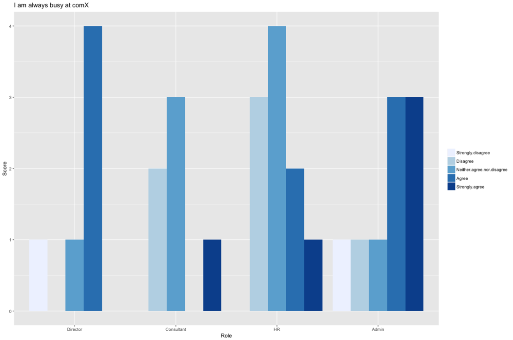
These pivot tables can be investigated later on or used to easily
create bar charts for each question like the one below:
# Read in the pivot table csv
pivot <- read.csv("pivot_tables/i_am_always_busy_at_comx.csv")
# Create heirarchies of response order, employee type
resp_order <- c("Strongly.disagree", "Disagree",
"Neither.agree.nor.disagree", "Agree", "Strongly.agree")
heirarchy <- c("Director", "Consultant", "HR", "Admin")
# Gather the pivot table into long format
pivot_gather <- pivot %>%
select(2:7) %>%
gather(Response, Score, Strongly.disagree:Strongly.agree)
%>%
mutate(Response = factor(Response, levels = resp_order)) %>%
mutate(Role = factor(what_type_of_employee_are_you, levels
= heirarchy))
# Create the plot
ggplot(pivot_gather, aes(x = Role, y = Score, fill = Response))
+
geom_bar(stat = "identity", position = "dodge") +
scale_fill_brewer(palette="Blues") +
theme(legend.title = element_blank()) +
ggtitle("I am always busy at comX")
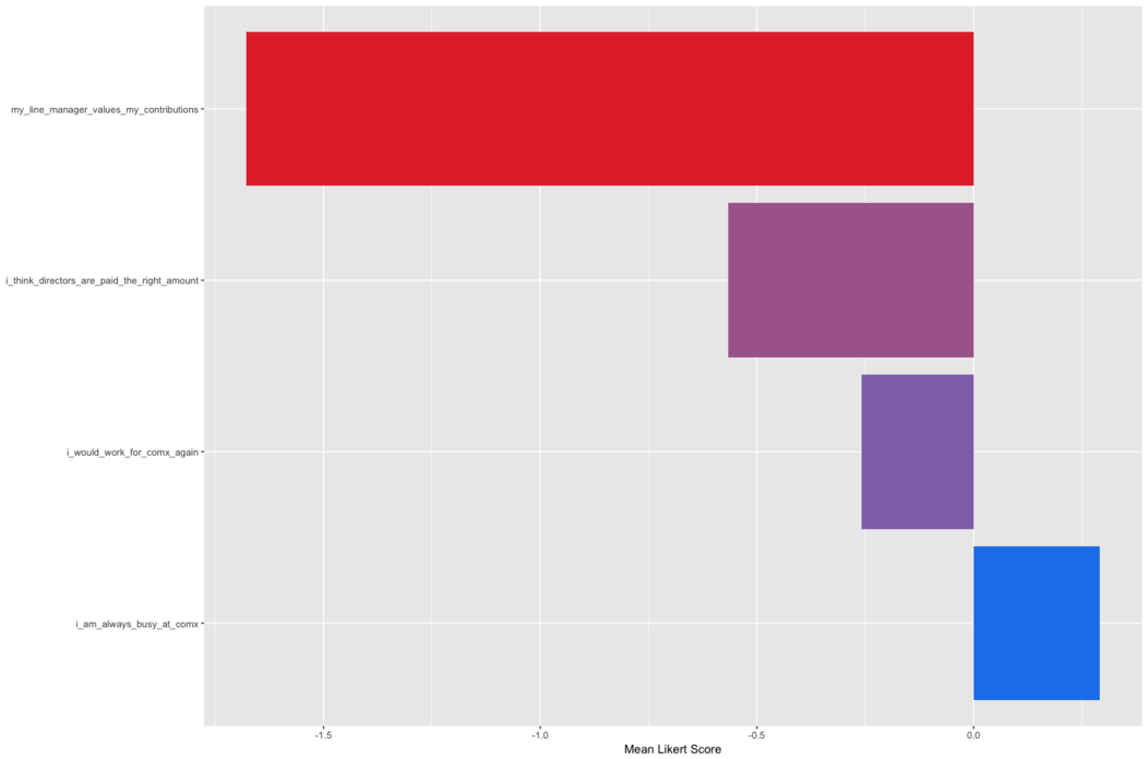
Overall question comparison
To see which questions get the worst score overall I can plot them
on a horizontal bar chart, ordering the bars and colouring them
according to the score:
survey_total_q <- survey_cond_num %>%
select(1:5) %>%
summarise_all(funs(mean(., na.rm = TRUE))) %>%
gather("question","mean_score") %>%
na.omit(TRUE) %>%
arrange(desc(mean_score))
ggplot(survey_total_q, aes(x = reorder(question,-mean_score), y
= mean_score, fill = mean_score)) +
geom_bar(stat = "identity") +
coord_flip() +
theme(axis.title.y = element_blank()) +
scale_fill_continuous(low = "#E33235", high = "#2183EB") +
theme(legend.position="none") +
ylab("`Mean Likert Score")
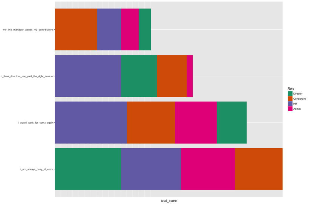
I can also break those bars down by which employee groups
contribute most of the score for that question:
survey_total_job <- survey_cond_num %>%
select(1:5) %>%
group_by(what_type_of_employee_are_you) %>%
na.omit(TRUE) %>%
summarise_all(funs(sum)) %>%
gather("question","total_score") %>%
mutate(what_type_of_employee_are_you = strrep(c("Director",
"Consultant", "HR", "Admin"), times = 1)) %>%
group_by(question, what_type_of_employee_are_you) %>%
filter(question != "Role") %>%
arrange(desc(total_score))
ggplot(survey_total_job[order(survey_total_job$total_score,
decreasing = T),],
aes(x = reorder(question,total_score), y =
total_score, fill = what_type_of_employee_are_you)) +
geom_bar(stat = "identity") +
coord_flip() + theme(axis.title.y = element_blank()) +
scale_fill_brewer(limits = heirarchy, palette = "Dark2") +
scale_x_discrete(limits =
as.vector(survey_total_q$question)) +
theme(axis.text.x = element_blank(),
axis.ticks.x = element_blank()) +
guides(fill=guide_legend(title="Role")) +
xlab("Total Likert Score")
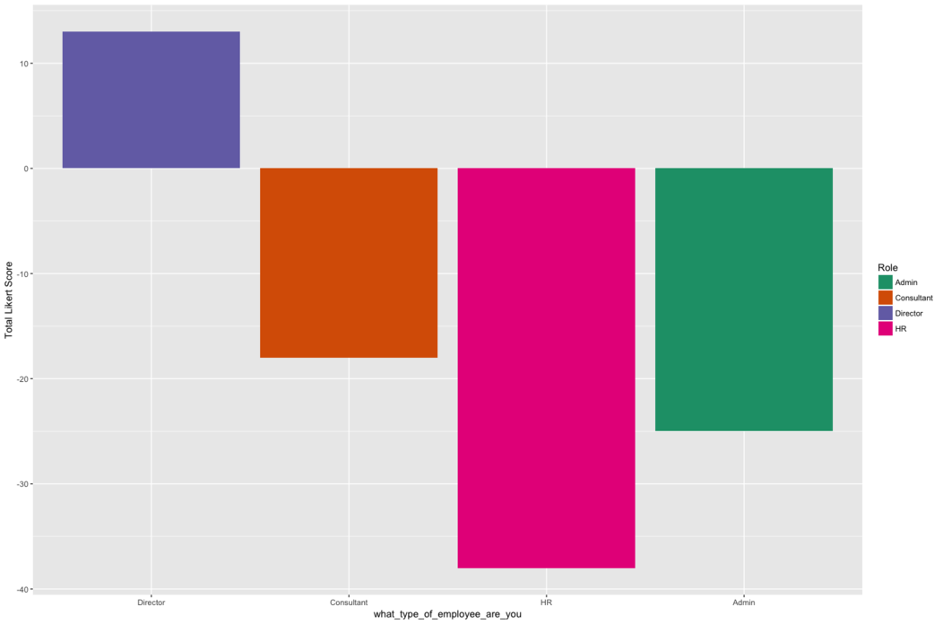
Finally, I can get a general sense of the satisfaction of each
employee by seeing the total score given by that employee:
role_total <- survey_cond_num %>%
select(1:5) %>%
replace(is.na(.), 0) %>%
group_by(what_type_of_employee_are_you) %>%
summarise_all(funs(sum)) %>%
mutate(sum = rowSums(.[2:length(.)]))
ggplot(role_total, aes(x = what_type_of_employee_are_you, y =
sum, fill = what_type_of_employee_are_you)) +
geom_bar(stat = "identity") +
ylab("Total Likert Score") +
scale_x_discrete(limits = heirarchy) +
guides(fill=guide_legend(title="Role")) +
scale_fill_brewer(palette = "Dark2")
Update 27th Oct. 2017
I ended up doing a bit more with survey data for an undergraduate
dissertation student that was looking at how gender affected
thoughts towards sustainable activity within the home, and how work
was partitioned in different types of household.
One of the best methods we came up with for graphically
representing correlations in responses to certain questions and the
demographic category a person fit into was the bubble plot. I guess
if you wanted to statistically analyse this data you would use a
chi-squared test.
The fake data for the plot below can be found here and a lookup
table for the contents of each question column can be found here.
The data .csv shows each row as a respondent, along with how many
hours of housework they do, their gender, the codes for checkboxes
they ticked of different sustainable activities they did, related
to waste management and water management, and lastly a
self-evaluated measure of how much they consider sustainable
actions in their day to day life.
[2](
https://johngodlee.xyz/files/likert/sust_behaviour.csv)
[3](
https://johngodlee.xyz/files/likert/question_lookup.csv)
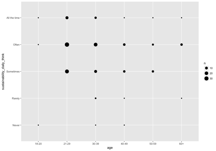
So I want to make a bubble plot of age vs. how often people think
about sustainable activities (sustainability_daily_think):
First, make a summary data frame which counts the number of
occurrences of each unique x y combination:
# Load data
sust_data <- read.csv("sust_behaviour.csv")
# Make summary
sust_bubble <- sust_data %>%
group_by(age, sustainability_daily_think) %>%
tally()
Then make the plot:
ggplot(sust_bubble, aes(x = age, y =
sustainability_daily_think)) +
geom_point(aes(size = n))
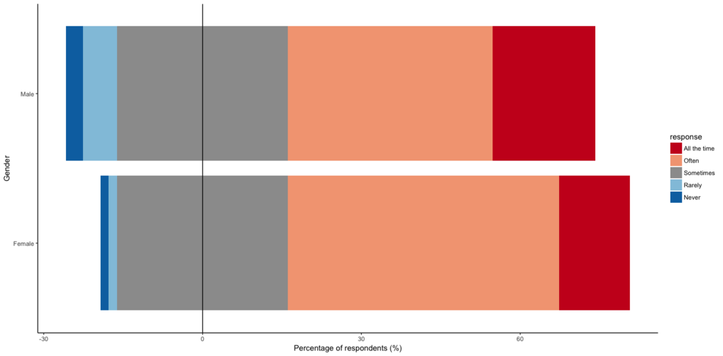
Another thing I managed to crack was how to make a diverging bar
chart in ggplot2, so it looks similar to the ones you can make with
the HH package.
[HH package]:
https://cran.r-project.org/web/packages/HH/index.html
Get set up, import data etc.:
# Packages
library(ggplot2)
library(dplyr)
library(tidyr)
library(RColorBrewer)
library(R.utils)
library(tidytext)
library(wordcloud)
# setwd to source file
setwd(dirname(rstudioapi::getActiveDocumentContext()$path))
# Load data
sust_data <- read.csv("sust_behaviour.csv")
question_lookup <- read.csv("question_lookup.csv")
# Make ordered factor
sust_data$sustainability_daily_think <-
factor(sust_data$sustainability_daily_think,
levels=c("Never", "Rarely", "Sometimes", "Often", "All the
time"),
ordered=TRUE)
# Remove NAs
sust_data <-
sust_data[!is.na(sust_data$sustainability_daily_think),]
anipulate the data so it's ready for plotting:
# Create a summary dataframe of likert responses to a single
question
sust_think_summ <- sust_data %>%
group_by(gender, sustainability_daily_think) %>%
tally() %>%
mutate(perc = n / sum(n) * 100) %>%
dplyr::select( -n) %>%
group_by(gender) %>%
spread(sustainability_daily_think, perc)
sust_think_summ_hi_lo <- sust_think_summ %>%
mutate(midlow = Sometimes / 2,
midhigh = Sometimes / 2) %>%
dplyr::select(gender, Never, Rarely, midlow, midhigh,
Often, `All the time`) %>%
gather(key = gender, value = perc) %>%
`colnames<-`(c("gender", "response", "perc"))
# Split data into high and low groups
sust_think_summ_hi <- sust_think_summ_hi_lo %>%
filter(response %in% c("All the time", "Often", "midhigh"))
%>%
mutate(response = factor(response, levels = c("All the
time", "Often", "midhigh")))
sust_think_summ_lo <- sust_think_summ_hi_lo %>%
filter(response %in% c("midlow", "Rarely", "Never")) %>%
mutate(response = factor(response, levels = c("Never",
"Rarely", "midlow")))
Construct the plot:
# Define colour palette and associate with locations
legend_pal <- brewer.pal(name = "RdBu", n = 5)
legend_pal <- insert(legend_pal, ats = 3, legend_pal[3])
legend_pal <- gsub("#F7F7F7", "#9C9C9C", legend_pal)
names(legend_pal) <- c("All the time", "Often", "midhigh",
"midlow", "Rarely", "Never" )
# Make plot
ggplot() +
geom_bar(data=sust_think_summ_hi, aes(x = gender, y=perc,
fill = response), stat="identity") +
geom_bar(data=sust_think_summ_lo, aes(x = gender, y=-perc,
fill = response), stat="identity") +
geom_hline(yintercept = 0, color =c("black")) +
scale_fill_manual(values = legend_pal,
breaks = c("All the time", "Often", "midhigh",
"Rarely", "Never"),
labels = c("All the time", "Often", "Sometimes",
"Rarely", "Never")) +
coord_flip() +
labs(x = "Gender", y = "Percentage of respondents (%)") +
ggtitle(question_lookup$survey_question[question_lookup$column_title
== "sustainability_daily_think"]) +
theme_classic()