TITLE: Analysing Ledger Personal Accounting Data Using R
DATE: 2017-09-01
AUTHOR: John L. Godlee
====================================================================
Ledger
- You can read the file without any fancy programs, just a text
editor
- Even if Ledger stops being maintained, you can still use the
journal file
- The file can be interpreted using many other programming
languages, like R!
To properly visualise how my finances are changing over time
however, I find the text based reports provided by ledger-cli a bit
dense and fiddly.
This post might be an exercise in reinventing the wheel. Ledger
already has a decent web-based reporting system that can provide
pretty graphs and lots of other ledger-like apps that can do
similar. But my language of choice for making pretty graphs and
manipulating data is 'R', so I'm going to use that.
[web-based reporting system]:
https://github.com/ledger/ledger-web
ost of the code below is actually data manipulation, which I've
chosen to do with the dplyr package, creating the plots in ggplot2
isn't too taxing. I've created an example script here and you can
find the example .ledger.journal file I used here
[here](
https://johngodlee.xyz/files/ledger/ledger_journal_analysis.R
)
[1](
https://johngodlee.xyz/files/ledger/example_ledger.journal)
Firstly, export your ledger journal file (.ledger.journal) as a
csv in the terminal, the name and filepath of your journal file
might be different:
touch ledger.csv
ledger csv -f ~/.ledger.journal > ledger.csv
And that's the last thing we'll be doing in the shell, everything
else will be in R. So fire up an R session to start analysing the
data.
Firstly set the working directory, import the csv file and load
some packages:
# set working directory to `.ledger.journal`
setwd()
# Create vector of column names
journal_names <- c("Date", "NA_1", "Description", "Source",
"Currency", "Amount", "NA_2", "NA_3")
# Import csv
ledger <- read.csv("ledger.csv", col.names = journal_names)
# Load packages
library(dplyr)
library(ggplot2)
Now to make the ledger dataframe easier to use:
# Convert "Date" column to date class
ledger$Good_date <- as.Date(ledger$Date, format = "%Y/%m/%d")
class(ledger$Good_date) # To check the above worked
# Sort by "Good_date"
ledger_sort <- ledger[order(ledger$Good_date),]
# Add cumulative column for each source
ledger_cumsum <- ledger_sort %>%
group_by(Source) %>%
mutate(Cumulative = cumsum(Amount))
The rest involves creating a few graphs that I find useful. For all
these plots to work in their current form however, your Source or
"Account" structure must be the similar to the recommended
structure found in the ledger-cli example journal, e.g.:
[ledger-cli example journal]:
http://ledger-cli.org/3.0/doc/ledger3.html#Example-Journal-File
┃
┣Assets
┃┣Checking
┃┣Savings
┃┗Cash
┣Income
┃┣Work
┃┗Ebay_sales
┗Expenses
┣Socialising
┣Bills
┗Mortgage
For instance if I had to pay a bill in ledger, the journal entry
might look like this:
2017/12/06 Electricity bill
Assets:Checking $-65.51
Expenses:Bills $ 65.51
But it should be trivial to change the code to match your journal
structure.
Assets over time

Create a data frame only containing assets:
assets <- ledger_cumsum %>%
filter(grepl("Assets", Source))
Then make the plot:
ggplot(assets, aes(x = Good_date, y = Cumulative, group =
Source)) +
geom_hline(aes(yintercept = 0), colour = "red") +
geom_line(aes(colour = Source), size = 1.2) +
geom_point(aes(colour = Source), size = 2) +
scale_x_date(date_breaks = "1 week", date_labels = "%W/%y")
Viewing a particular asset in detail over time
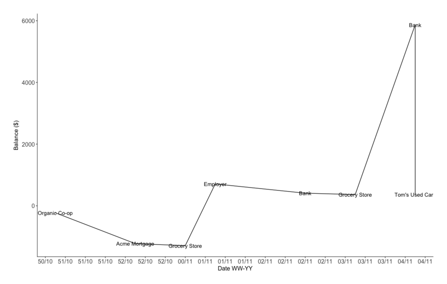
# Create data frame
assets_bank_current <- ledger_cumsum %>%
filter(Source == "Assets:Checking")
# Line plot of student account over time with description of
expenditure
ggplot(assets_bank_current, aes(x = Good_date, y = Cumulative,
group = Source, label = Description)) +
geom_line() +
geom_text() +
scale_x_date(date_breaks = "2 days", date_labels = "%W/%y")
+
xlab("Date WW-YY") +
ylab("Balance ($)")
Bar plots with breakdown of expenses
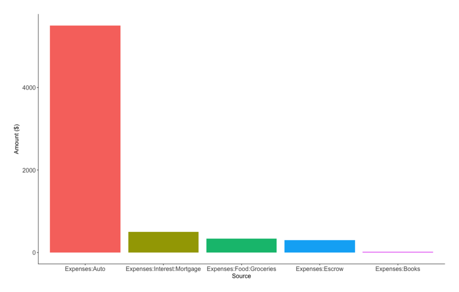

# Create summary dataframe of expenses
expenses_sum <- ledger_cumsum %>%
filter(grepl("Expenses", Source)) %>%
group_by(Source) %>%
summarise(Amount = sum(Amount)) %>%
mutate(Percentage = Amount / sum(Amount) * 100) %>%
mutate(Source = factor(Source, levels =
Source[order(Amount, decreasing = TRUE)])) # Create ordered factor
for x axis
# Bar plot
ggplot(expenses_sum, aes(x = Source, y = Amount)) +
geom_bar(stat = "identity", aes(fill = Source)) +
theme(legend.position = "none") +
ylab("Amount ($)")
# Stacked percentage bar chart
ggplot(expenses_sum, aes(x = NA, y = Percentage, fill =
Source)) +
geom_bar(stat = "identity") +
geom_text(aes(label = paste(round(Percentage, digits = 2),
"% - ", Source, sep="")), position=position_stack(vjust=0.5))
Last 30 days income/expenses summary
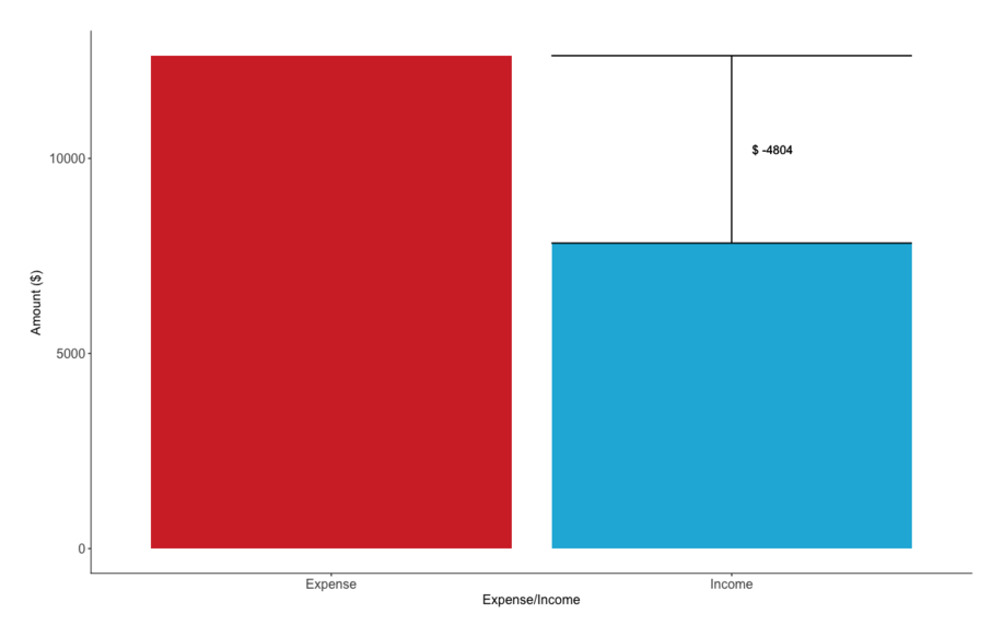
Creating this plot was fun, I had a go at using ifelse() arguments
inside the ggplot() call in order to change the position of an
error bar and text (which I've used to show deficit) depending on
whether I've made a net gain or loss that month.
# Create summary dataframe
ledger_30d_summ <- ledger_cumsum %>%
filter(Good_date > as.Date(Sys.Date(), format = "%Y-%m-%d")
- 30) %>%
filter(grepl("Assets", Source)) %>%
mutate(expense_income = if_else(Amount > 0, "Income",
"Expense")) %>%
group_by(expense_income) %>%
summarise(Total = sum(Amount)) %>%
mutate(Total = abs(Total))
# Create colour palette
expense_income_palette <- c("#D43131", "#1CB5DB")
# Create plot
ggplot(ledger_30d_summ, aes(x = expense_income, y = Total),
environment = environment()) +
geom_bar(stat = "identity", fill = expense_income_palette)
+
geom_errorbar(aes(x = ifelse(ledger_30d_summ$Total[1] >
ledger_30d_summ$Total[2], "Income", "Expense"),
ymax = max(ledger_30d_summ$Total),
ymin = min(ledger_30d_summ$Total))) +
geom_text(aes(x = ifelse(ledger_30d_summ$Total[1] >
ledger_30d_summ$Total[2], "Income", "Expense"),
y = min(ledger_30d_summ$Total) +
0.5*(max(ledger_30d_summ$Total) - min(ledger_30d_summ$Total)),
label = ifelse(ledger_30d_summ$Total[1] >
ledger_30d_summ$Total[2],
paste("$ -", max(ledger_30d_summ$Total) -
min(ledger_30d_summ$Total), sep = ""),
paste("$ ", max(ledger_30d_summ$Total) -
min(ledger_30d_summ$Total), sep = "")),
hjust = -0.5)) +
xlab("Expense/Income") +
ylab("Amount ($)")
Now that I've defined all these plots, it shouldn't take too much
effort to turn them into a basic Shiny app that I can load up in my
web browser, or run a script that saves the plots as images on my
computer so I can look at them later.